## Tableau walk-through ### Cooper Comics Collection data - We will use the **Cooper Comics Collection** dataset. - In this example, we will begin with the **Cooper Collection Stories** sheet. - You can later adapt the same process to a different sheet or question. [Cooper Comics Collection data](https://mikrowelle.github.io/cooper-comics-final/data/Cooper%20Comics%20Reprint%20Metadata.xlsx)
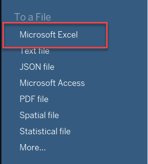
## 1. Load the data - Open Tableau. - Under **To a File**, click **Microsoft Excel**. - Select the Cooper Comics Collection Excel file.
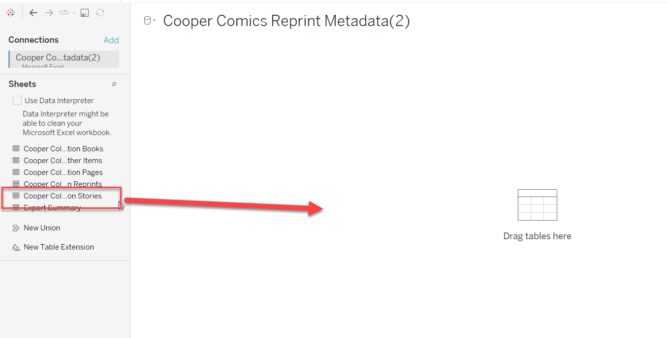
## 1. Load the data - Drag **Cooper Collection Stories** to **Drag tables here**. - Tableau will show a preview of the data.
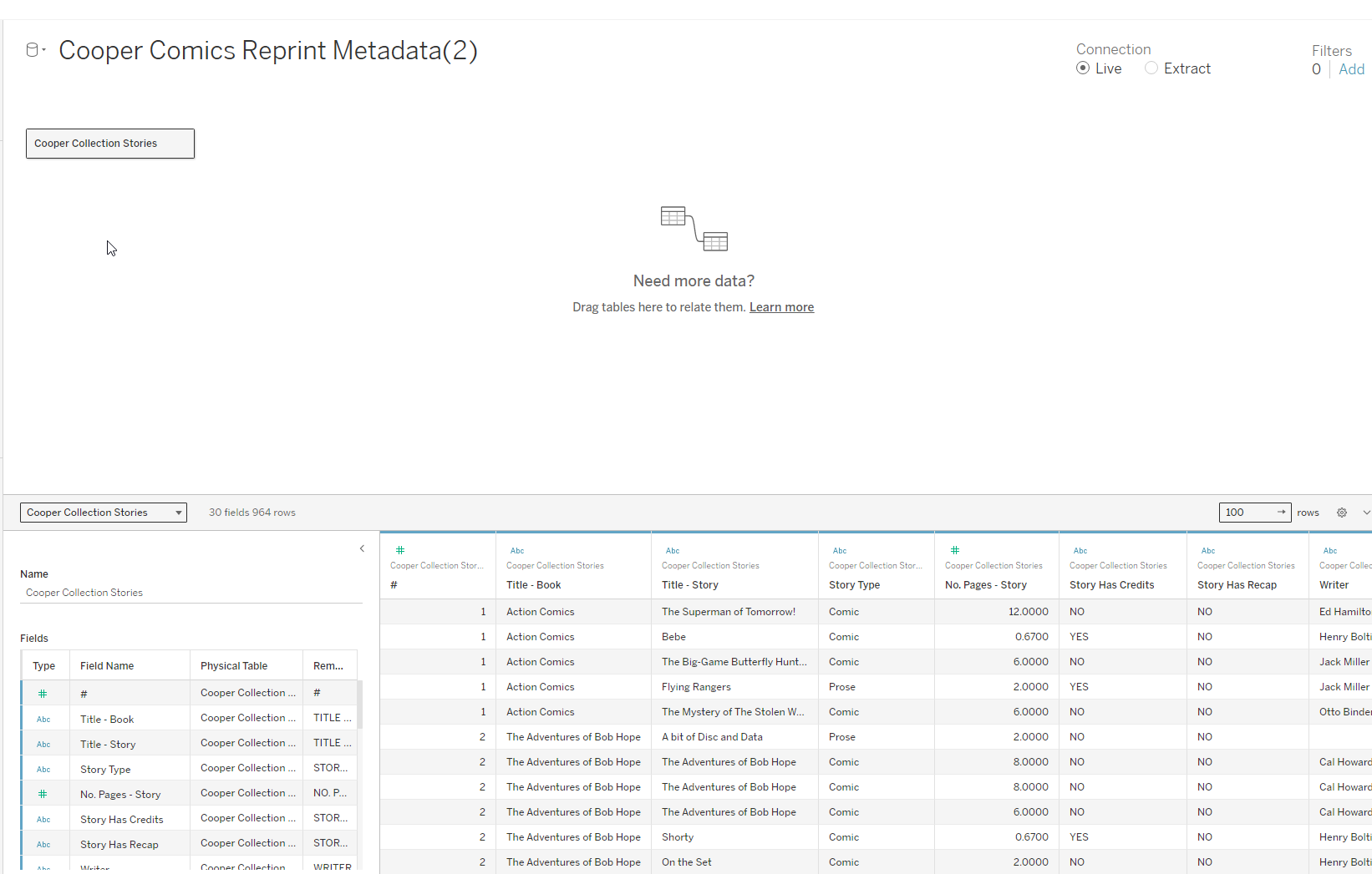 Data preview after loading **Cooper Collection Stories**.
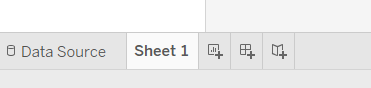
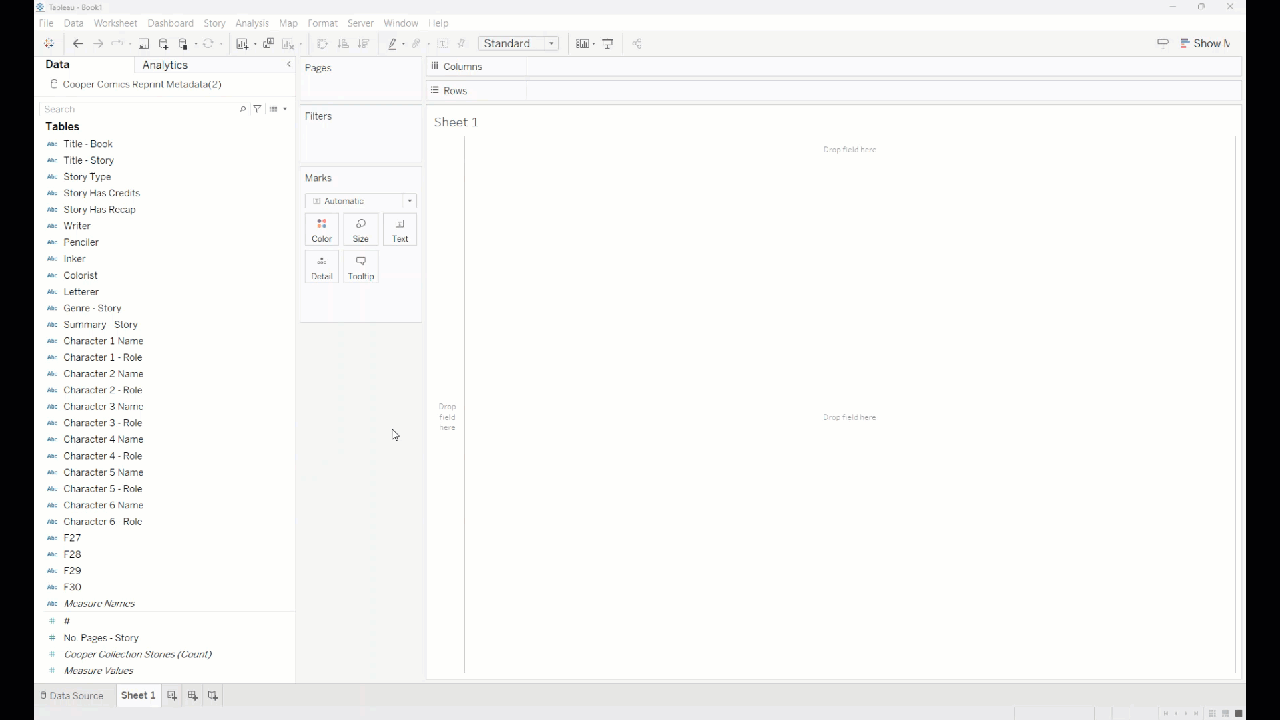
## 1. Load the data - Click **Sheet 1** at the bottom of the window. - This takes you from the data source page to a worksheet where you can build a view.
## 2. Get oriented in the worksheet In **Sheet 1**: - the left sidebar contains the fields from your dataset - the center is where Tableau builds the view - the **Rows** and **Columns** shelves control how the view is organized
## 2. Get oriented in the worksheet Tableau separates fields into: - **Dimensions**: categories such as title or genre - **Measures**: numeric values Tableau can count, sum, or otherwise aggregate
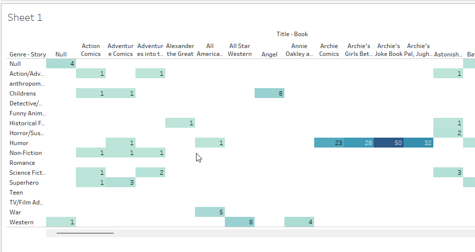
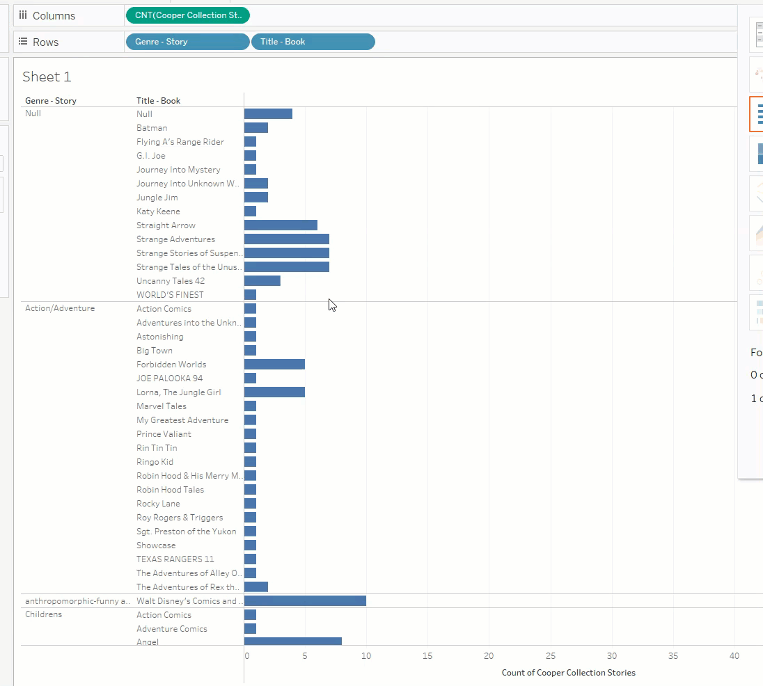
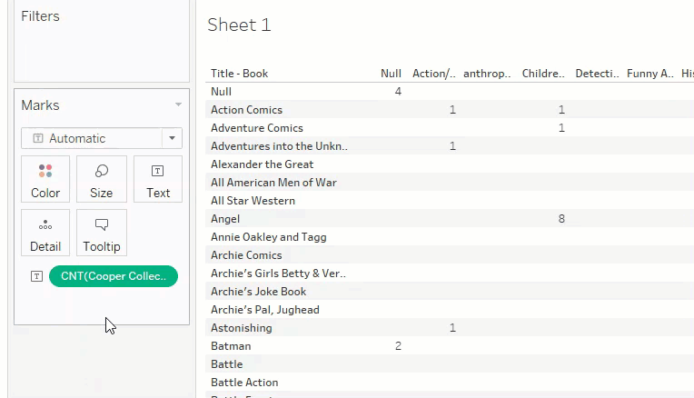
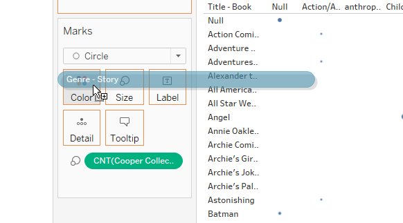
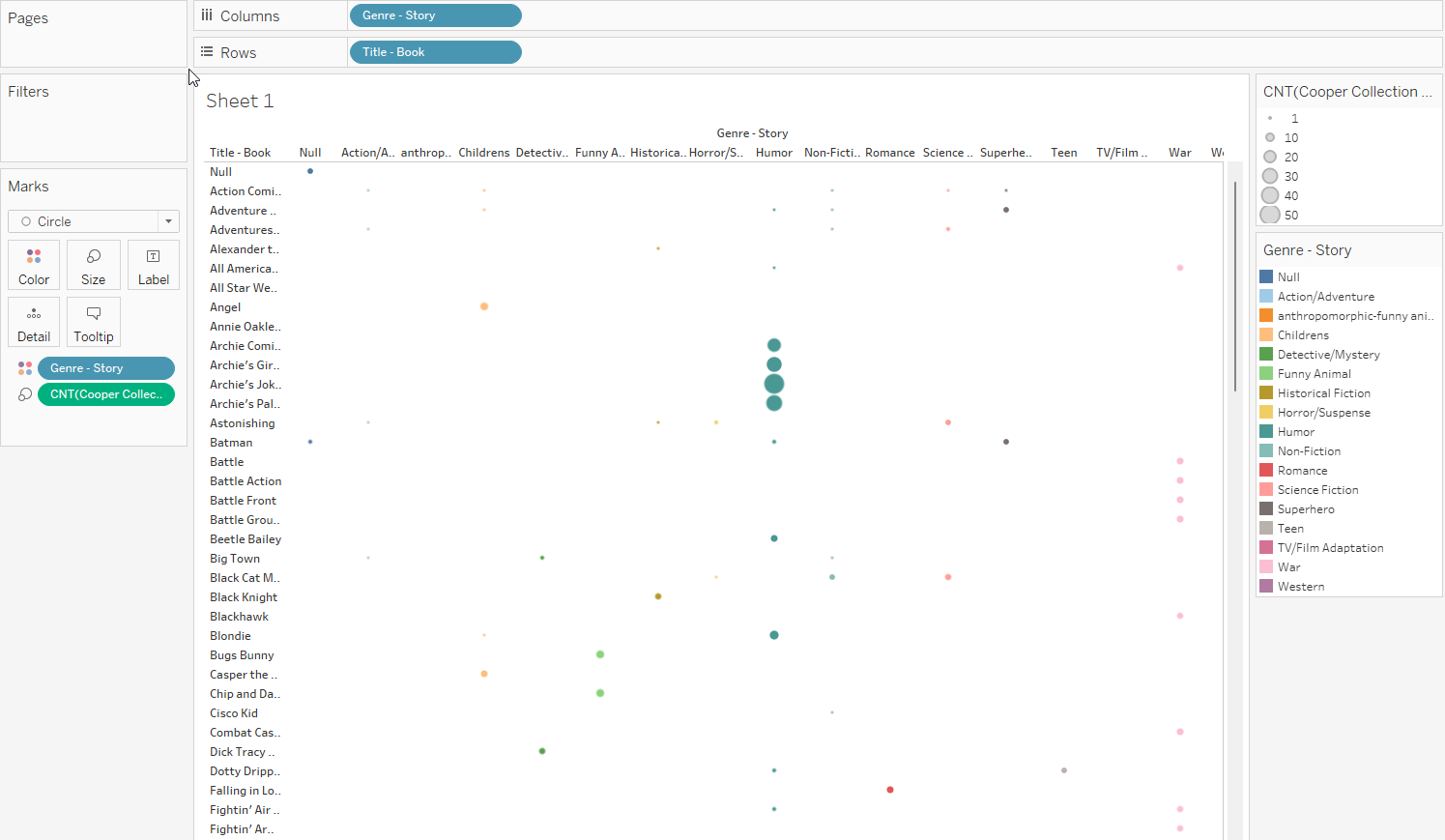
## 3. Build a simple table Let’s create a table that shows how many stories of each genre appear in each book. 1. Drag **Title - Book** to **Rows**. 2. Drag **Genre - Story** to **Columns**. 3. Drag **Cooper Collection Stories (Count)** into the center of the view.
## 3. Build a simple table You should now have a table showing the count of stories for each combination of: - **book title** - **story genre**
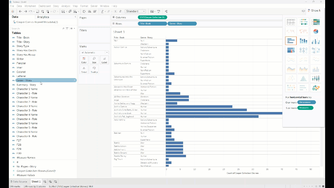
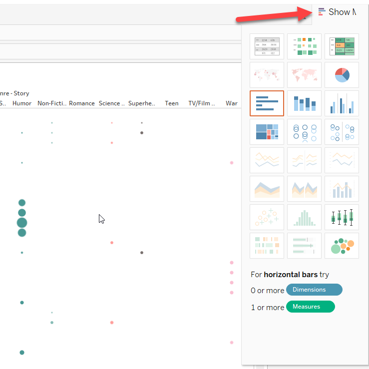
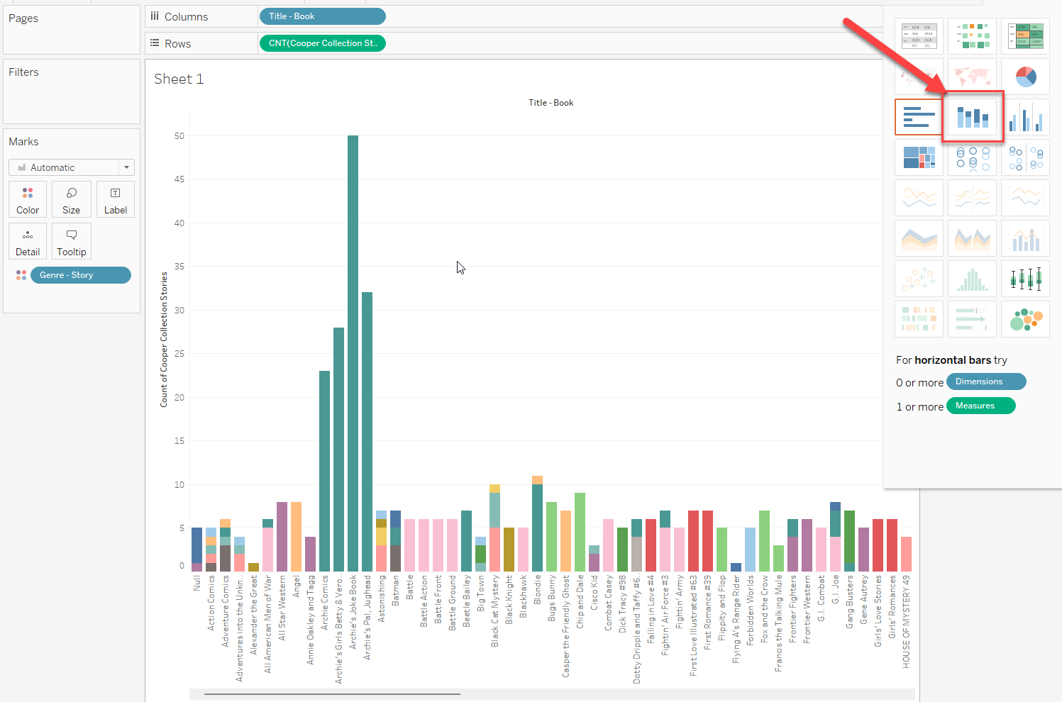
## 4. Create a bar chart A bar chart is a good next step because it makes differences in count easier to compare. - Open **Show Me**. - Choose a **bar chart**.
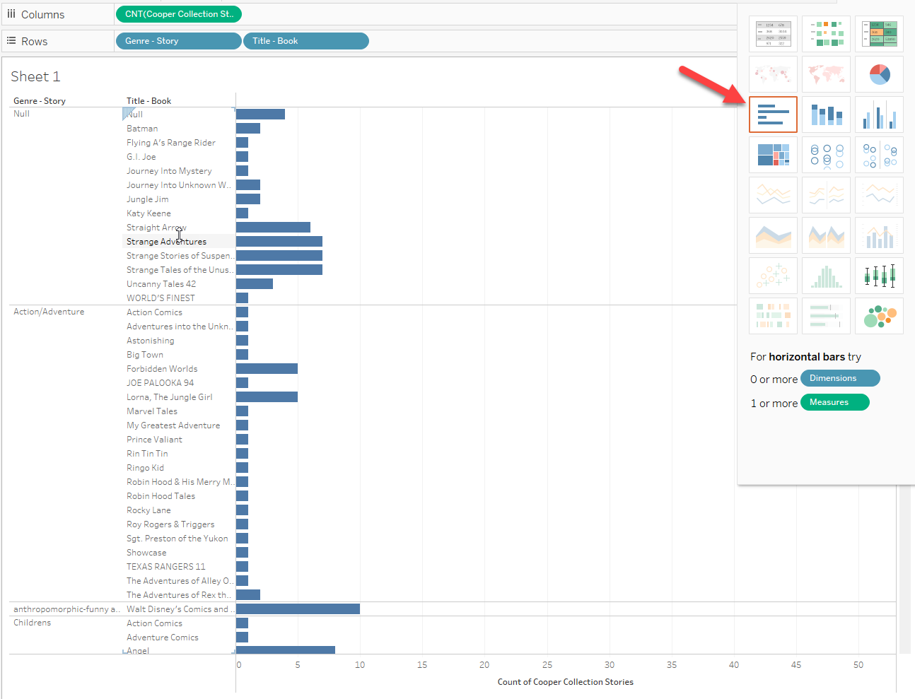 A first bar-chart view based on the fields already in the worksheet.
## 4. Create a bar chart If the chart is hard to read, rearrange the fields on the shelves. This changes whether you see: - books grouped within genres, or - genres grouped within books
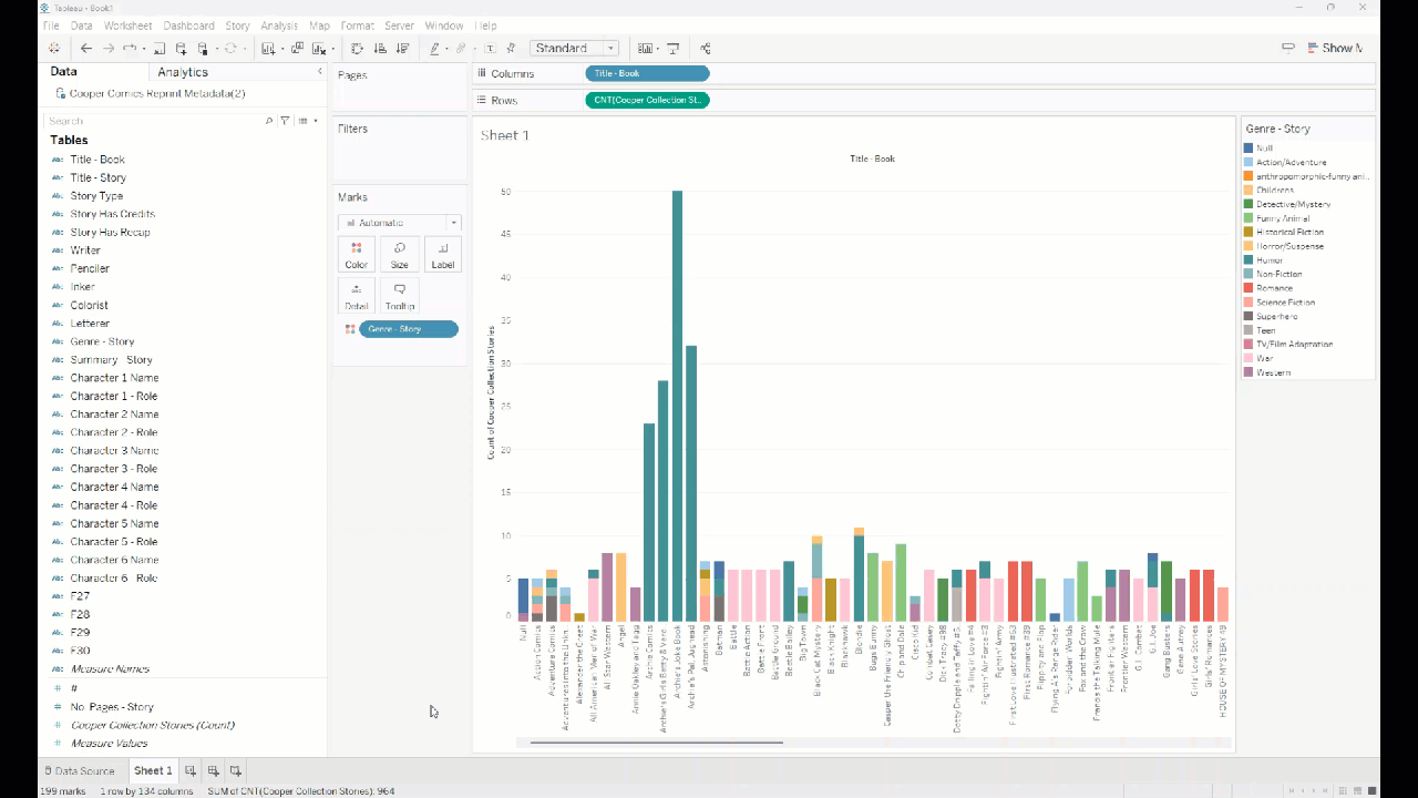
## 4. Create a bar chart To make categories easier to distinguish: - drag **Genre - Story** to **Color**
## 4. Create a bar chart If you want numbers on the bars: - drag **Cooper Collection Stories (Count)** to **Label**
## 5. Edit titles and labels At this point, you should have a readable chart. Now make it easier to understand by improving: - the worksheet title - the axis title - the overall formatting
## 5. Change the worksheet title - Double-click the title above the view. - Enter a more descriptive title.
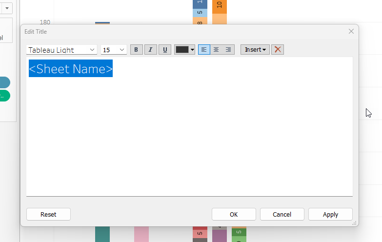
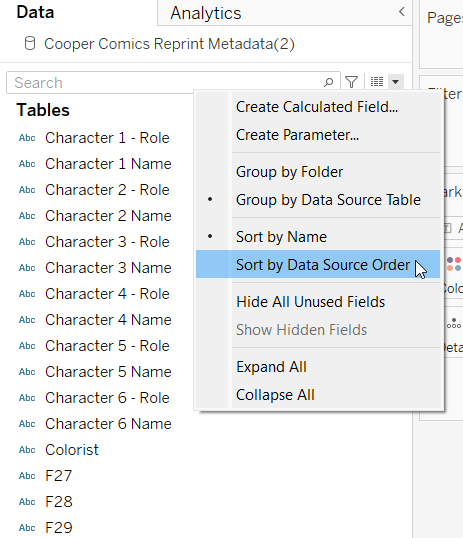
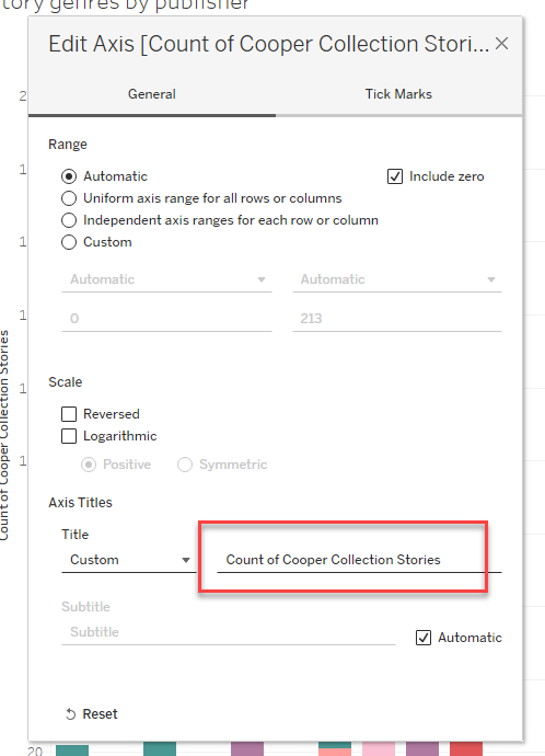
## 5. Change an axis title You can edit an axis title in two ways: 1. Double-click the axis title in the chart. 2. Or right-click a field name in the data pane and choose **Rename**.
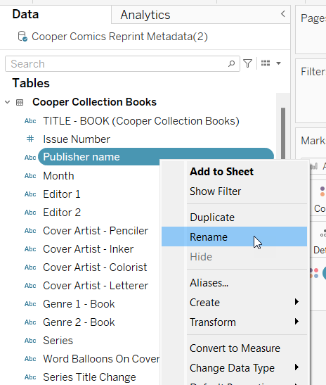 Rename a field in the data pane.
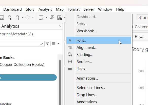
## 5. Change formatting To adjust font, borders, alignment, and related settings: 1. Go to **Format** in the top menu. 2. Choose the setting you want to edit. 3. Use the formatting pane that opens on the left. Do not get stuck polishing.
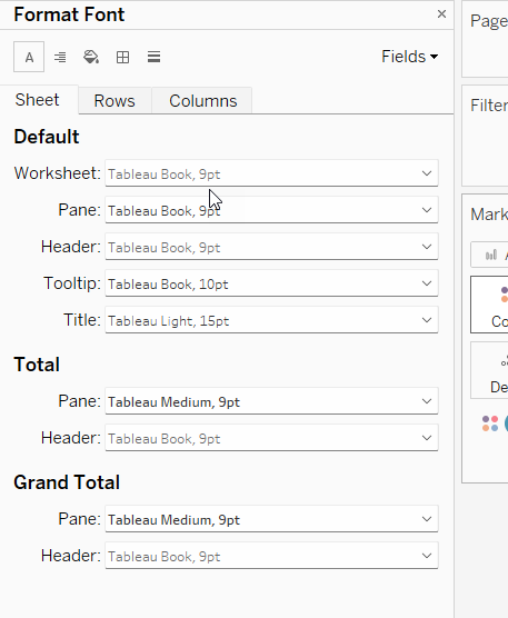 Formatting pane.
## 6. Optional: try another chart type If you want to explore further, you can try a different view of the same data.
## Optional: heat map A heat map can make higher and lower values stand out more clearly. - Open **Show Me**. - Choose a heat-map style view.
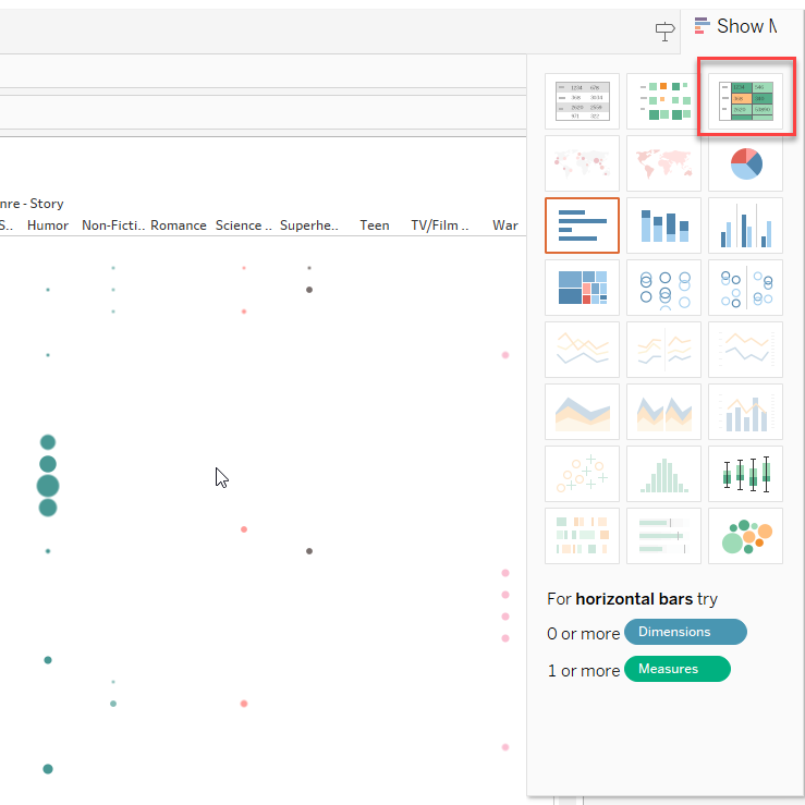 Heat-map style view.
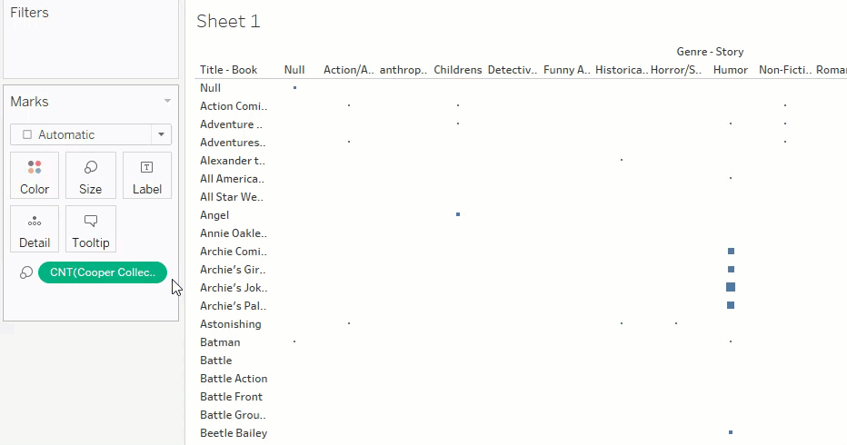
## Optional: marks-based view You can also build a marks-based view: - drag **Cooper Collection Stories (Count)** to **Size** - drag **Genre - Story** to **Color**
 Adjust mark type or size.
 Add color by genre.
 Colored marks view.
 A stacked bar chart is another alternative.
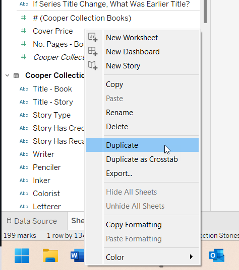
## 7. Optional: duplicate a sheet If you want to keep one version of your chart and make a second version without starting over: 1. Right-click the **Sheet 1** tab. 2. Choose **Duplicate**.
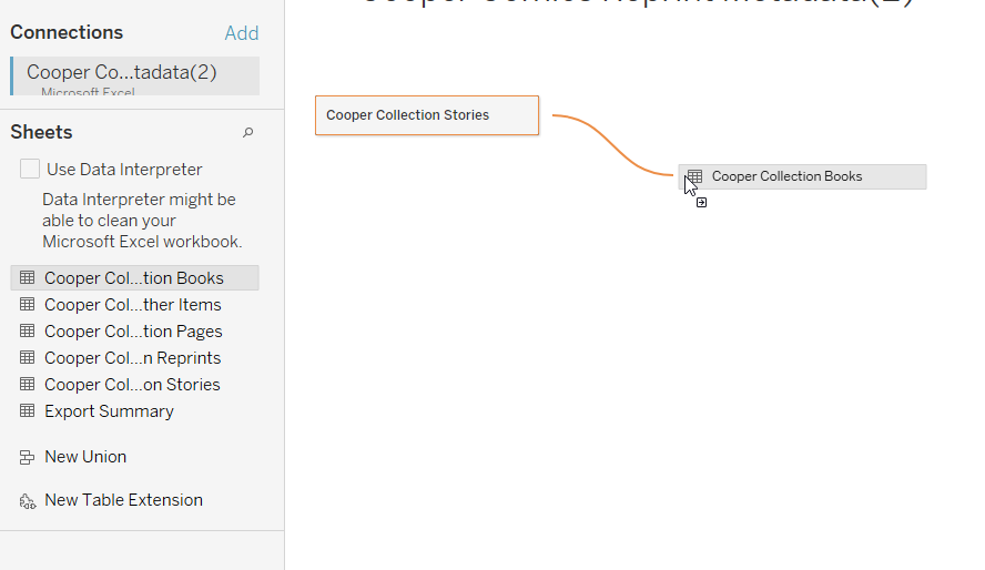
## 8. Optional: join two sheets Use this only if you want to combine information from different sheets. For example: - the **Stories** sheet includes story-level information - the **Books** sheet includes book-level information such as publisher
## 8. Optional: join two sheets 1. Go back to the **Data Source** tab. 2. Drag **Cooper Collection Books** into the top area with **Cooper Collection Stories**.
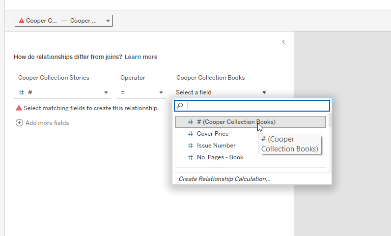
## 8. Optional: join two sheets - Tableau will ask how the two sheets relate. - Set the matching field in both sheets to **#**.
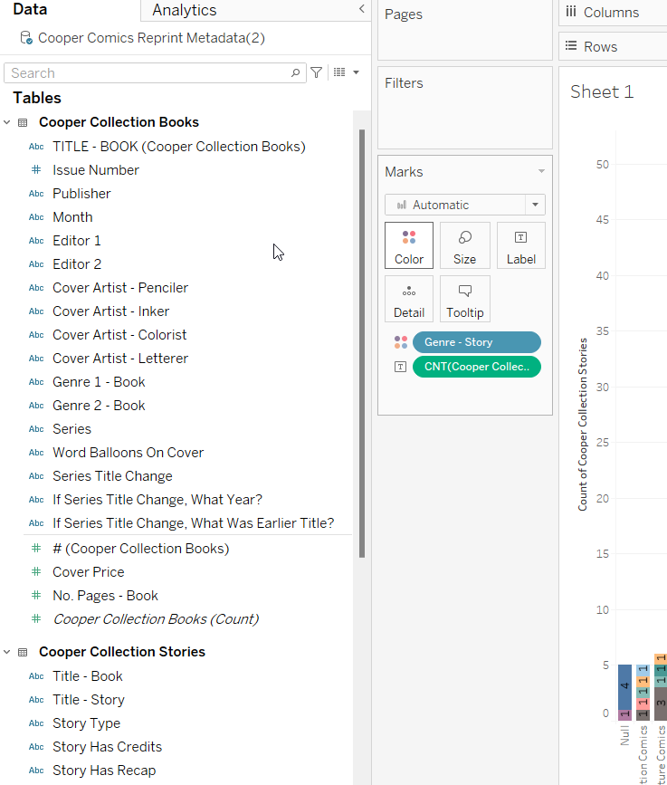 After the join, fields from both sheets are available in the data pane.
## By the end, you should have - one Tableau worksheet built from the Cooper data - one readable visualization - a title and labels that make the chart understandable The goal is not a perfect chart. The goal is to move from spreadsheet data to a simple, readable visualization.